
Welcome back to our practical blog post series about using uberAgent products in helpdesk scenarios. In this second article, we want to address the use case of our Experience Score Overview dashboard.
We recommend reading the articles in this series successively in the following order:
- uberAgent in the Helpdesk Pt. 1 – The helpdesk app
- uberAgent in the Helpdesk Pt. 2 – The Experience Score Overview (this article)
- uberAgent in the Helpdesk Pt. 3 – The Score Dashboards
- uberAgent in the Helpdesk Pt. 4 – The Security Score
Overviews from different perspectives
In our last article, we learned what the helpdesk app can do for you if you want to analyze a particular session or machine. But how would you proceed if you wanted to begin your analysis with a more general overview of your environment – if you wanted to check how everything is going? Before addressing the Experience Score Overview dashboard, we want to ensure that everyone has an idea of how we see enterprise IT.
Categories And components to consider
There are three categories one should consider when thinking about an overview of the environment: user sessions, applications, and machines.
These categories consist of various components that each affect the digital employee experience. CPU, RAM, and Disk IO are components that are available in all three categories. When looking specifically at the machines category, we see additional components such as stop errors (BSODs), disk space, and network availability. In terms of user sessions, the dashboard displays components for logon duration, protocol latency, and input delay. Looking at applications, components such as app errors, UI delay, network availability, and latency, as well as input delay, are added to the standards.
Experience Score: Issue identification made asy!
The Experience Score Overview is the entry point when opening the uberAgent UXM Splunk app. The idea is to ensure that customers directly see what is happening and where potential issues originate without being overwhelmed by information. As the name indicates, the dashboard comes with a scoring system that rates components and categories on a scale from zero to ten. Ten is the highest score and stands for an excellent result. Zero is a bad score, indicating that there is a major problem.
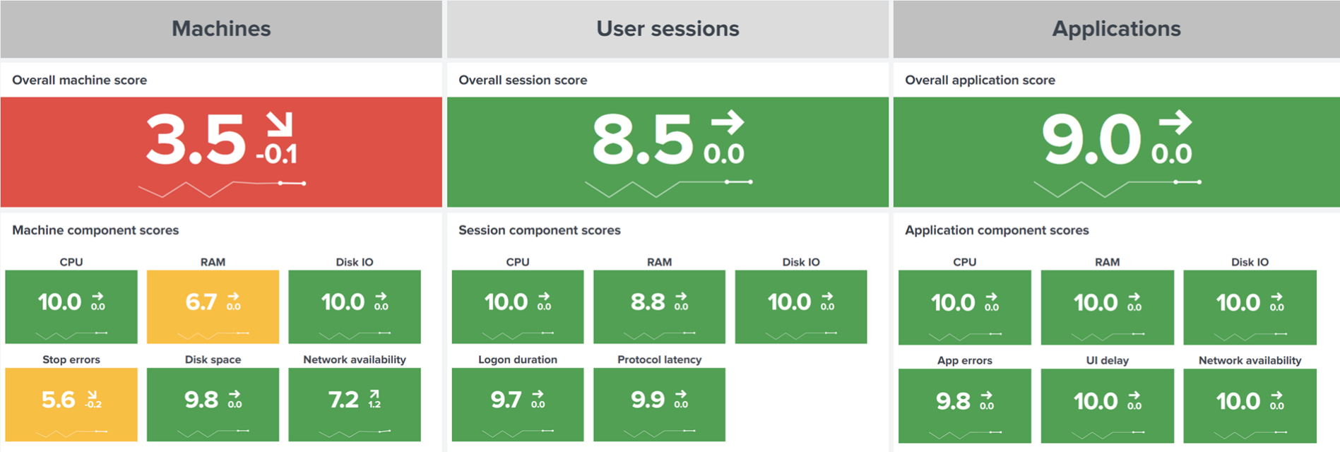
These scores are visualized similarly to a traffic light system. Green means everything is working as expected; yellow suggests there is potential for improvement. Red represents issues that need attention. Just by looking at the colors, you immediately have a good idea of how your IT landscape is doing.
Further analysis
We agree that it’s not easy to troubleshoot with just scores and colors. That’s why we implemented an analysis view. Below the aggregate component scores, you can see the scores for individual items (machines, user sessions, or applications, depending on your selection).

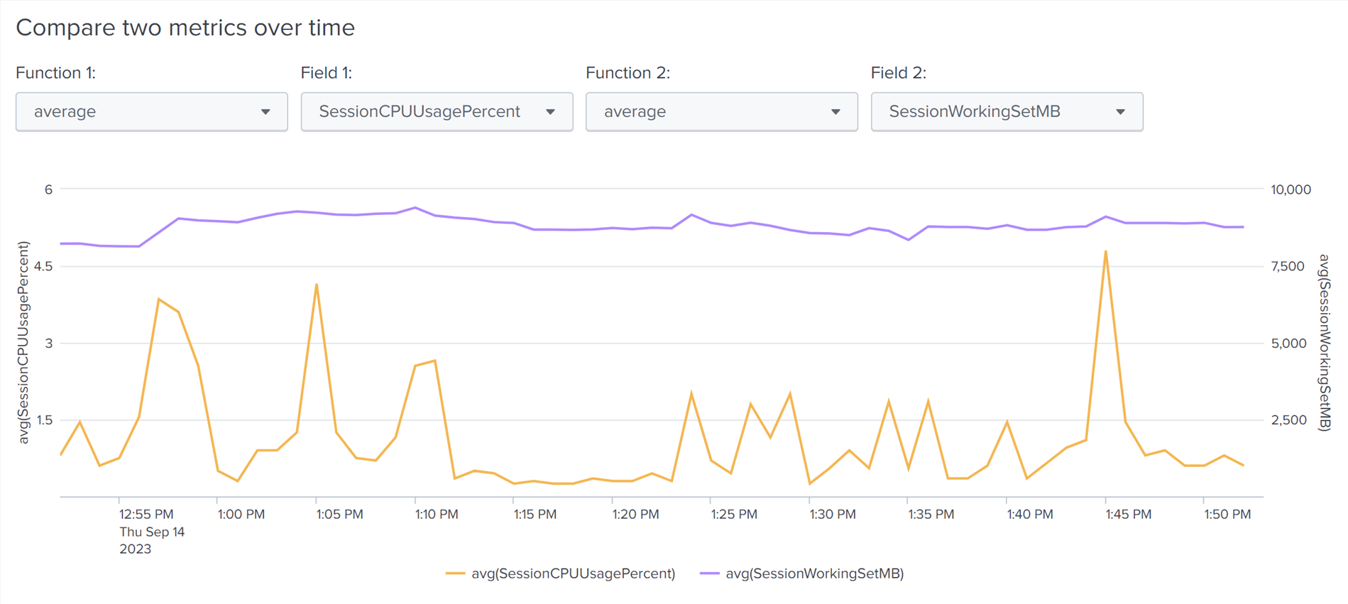
Clicking on an item of interest opens a time chart that shows how the component scores have changed over time for the selected machine, user session, or application. That graph offers a glimpse into recent history, often indicating when a problem started to occur. If, for example, you’re investigating a machine with a bad stop error score, you’re interested in when stop errors began to appear.

In the screenshot above, issues became more frequent at the highlighted point on September 14th.
Now that you’ve figured out when the stop errors started, think about what changed at that particular time. Common reasons include updates being installed, new software being deployed on a machine, or drivers being changed, to name just a few.
Once you’ve seen what happened over time, you can conclude your analysis by clicking the Analyze button. Depending on the category, Splunk takes you to one of our more detailed dashboards. Let’s take a look at the three analysis options.
Examine machines in detail
For machines, clicking on the analyze button takes you to the Single Machine Detail dashboard:

It shows applications in use on this host, network targets the machine connected to, and helpful hardware inventory information. The dashboard also displays statistical performance metrics over time, such as network data volume and latency, as well as CPU and RAM usage.
Analyze user sessions over time
When analyzing a specific user, Splunk opens the Analyze Data Over Time dashboard filtered for the selected user session. This newly opened dashboard displays general information about a user session. If you’re analyzing a remote session, the dashboard displays remoting information such as client name, IP address, or client version, among others. The dashboard allows you to compare various performance metrics over time, e.g., a session’s average CPU usage with its RAM usage:
Other metric comparison options are available, too.
Detect application performance problems
When examining an application, the drill-down option takes you to our more detailed Single Application Performance dashboard. When it comes to monitoring applications, uberAgent works a little magic. Operating systems don’t care about applications; they only know about processes. But when monitoring application performance, you need to sum up the values of all processes that belong to an application. That’s what uberAgent does for you behind the scenes. It automatically groups processes into logical application units so you can genuinely analyze application performance.
The dashboard starts with an overview panel that shows all processes that are part of the selected application, along with performance metric averages:
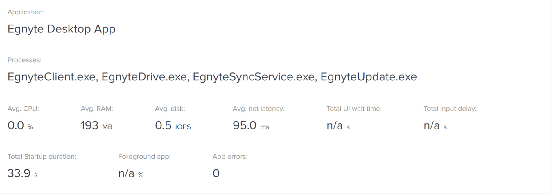
Scroll down for lists of the application’s users and the hosts on which it was executed. Below, charts display performance correlation options and established network connections. The dashboard highlights the data volume and number of packets sent/received over time, as well as the network targets the application connected to. If your users are experiencing application crashes, hangs, and/or UI delays, you can also see those here.
Specific category overviews
While the Experience Score Overview offers plenty of information to get an overview of the entire estate, we thought it might be helpful to have this kind of high-level view for each of the individual categories, too. That’s why we’ve developed individual score dashboards for machines, user sessions, and applications. The next article in this series will cover our Machines/Users/Application Score dashboards.